
Nazso Nazso
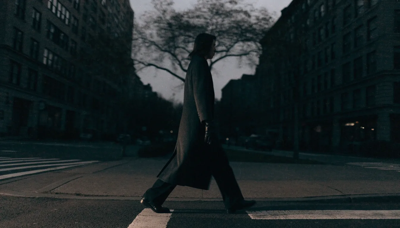
A lone figure crossing a dusk street corner in a long dark tailored coat

Brand notes on the houses shaping 2026

Eight houses, read for their logic rather than their logo

Start with what this page covers

These notes describe what selected fashion houses stand for, which silhouettes they're known for, and how their direction shows up in real dressing. They are written for readers who want to understand a brand's logic rather than shop it. Nothing here is sponsored, and no page links out to a purchase.

Coverage for the fall and winter 2026 season spans contemporary American labels, established luxury houses, and one of the most discussed avant-garde names in fashion. We've organized them around what each one actually contributes to the season's conversation — proportion, material, styling logic, or a shift in how a house reads.

Read the silhouette, not the styling
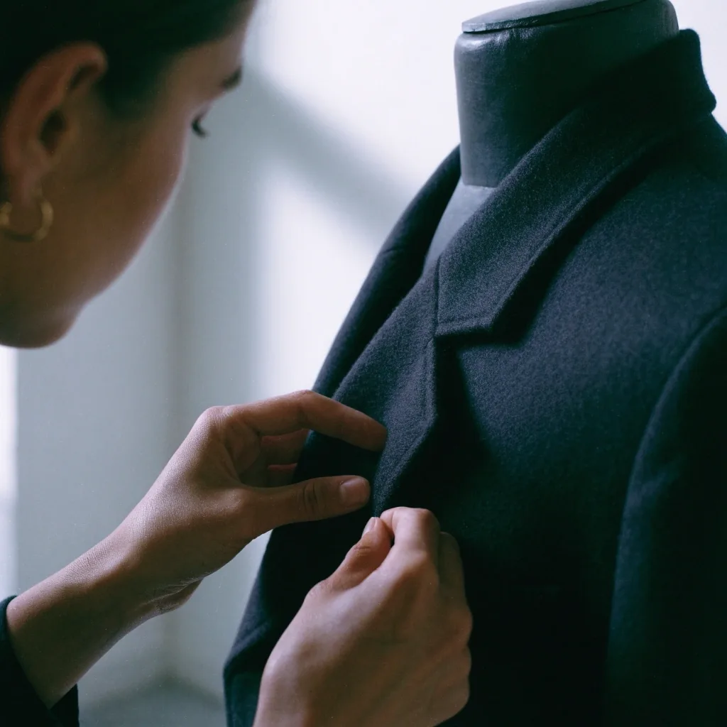
A macro view of wool twill fabric under raking light

What a house does in fabric is often more durable than what it does in a season's styling.

What this page covers

Eight houses, listed below, each with its own short note. Read them in any order — the notes don't build on one another.

Fall / winter 2026 season

Tory Burch

Color and polish, kept clean enough for a working day.

Proportion control

Kallmeyer

Minimalism that keeps enough volume to feel alive.

Smart minimalism

Saint Laurent

Classic foundations, sharpened toward evening.

Sharpness over basics

Miu Miu

Proportion play that arrives in ordinary clothing a season later.

Length and layering

Ralph Lauren

American heritage dressing, with the fabric story still moving.

Longevity argument

Stella McCartney

Tailoring with sportswear references, and material choices made plain.

Design position

Givenchy

Strict lines, evening weight, structure held where others loosen.

Architecture

Balenciaga

Avant-garde volume and line, read for where next season's shapes come from.

Reach and concept

Tory Burch, read for its proportion

Tory Burch: polished without being stiff

Tory Burch sits in a useful spot between everyday clothing and more composed dressing. In fall/winter 2026 coverage the brand is associated with color and polished styling, and that combination explains its appeal: pieces that look considered but don't feel formal. It's frequently read as a bridge between casual wear and something more put-together.

The silhouette lesson here is proportion control. Tory Burch's direction tends to keep lines clean and let color or a single detail carry the interest, which is why the label works as a reference for office and city dressing that doesn't read as rigid. If you want one outfit to do both a meeting and a dinner, this is the register to study.

In practice, that means watching two things: how long the jacket sits against the trouser, and how much color the outfit can carry without becoming the whole story. A saturated knit under a quiet coat is the shorthand. Bright trousers with a plain top is the other end of it. Both read as considered, neither reads as formal.
Kallmeyer, read for its restraint

Kallmeyer: minimalism that stays wearable

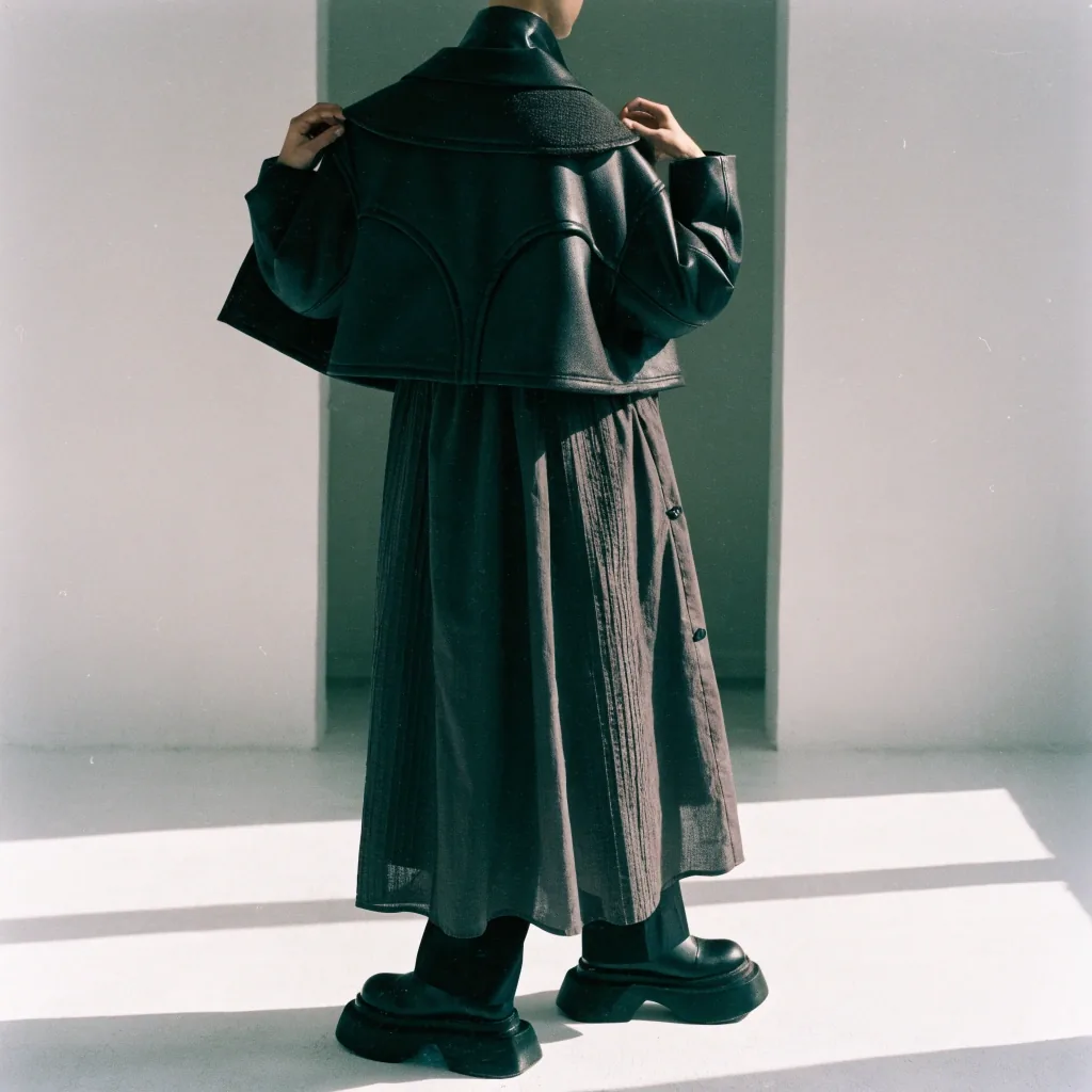
Kallmeyer appears in fall 2026 discussions as part of a wave of brands supporting a more practical modern aesthetic. The label is tied to clean silhouettes and wearable forms, and it tends to show up alongside conversations about smart minimalism rather than stark minimalism. That distinction matters, because the two are often confused.

Smart minimalism keeps enough volume and texture to look alive. Stark minimalism strips so much away that the outfit depends entirely on fit and fabric quality. Kallmeyer's work leans toward the first approach, which makes it a strong reference for city and office wardrobes where clothing has to function across a long day.

The tell in a look like this is what remains when nothing is added. A wide trouser, a clean shirt, a knit that holds its shape after a full day of wear. If a wardrobe has to survive a commute, a desk and a late train without being changed, this is the register worth copying rather than the stark version.

Two minimalisms, side by side

Smart minimalism
Keeps volume and texture, so the outfit reads as alive rather than rehearsed. Depends on cut more than on decoration.
Stark minimalism
Strips the surface away, so fit and fabric quality carry everything. Harder to wear across a long day without a change.
Saint Laurent, read for its edge

Saint Laurent: classic with an edge

Saint Laurent holds a sharper, more nocturnal position in the season. The house features in winter 2026 coverage around short fur jackets, and its aesthetic is generally read as evening-leaning, confident, and built on strong silhouettes. It's a reference point for how modern glamour gets defined rather than a source of everyday basics.

What makes the direction instructive is the balance. Saint Laurent's sharpness sits on top of fairly classic foundations, which is why the silhouettes transfer even when the styling doesn't. Take the proportion, the defined shoulder, the shorter jacket, and the deliberate contrast, and leave the rest.

The transferable idea is contrast at a fixed point. One sharp element against a plain base — a short jacket over a straight trouser, a defined shoulder against a soft knit — reads as deliberate rather than costumed. Worn all the way, the same direction becomes a look rather than a wardrobe.

Miu Miu, read for its proportion play

Miu Miu: proportions with a wink

Miu Miu regularly sets the tone in discussions of women's fashion and silhouette, and fall 2026 is no exception. The brand appears in seasonal coverage as part of a bolder, more unexpected wave of styling, where classic pieces get reworked through ironic or nonstandard details. Proportion play is central to how that reads.

This is one of the clearest examples of high fashion influencing mass trends. The mechanism is rarely a specific garment. It's an idea about length, layering, or contrast that gets absorbed into ordinary clothing a season later. Reading Miu Miu well means watching the proportion rather than the styling.

A mirror reflection of a woman adjusting a layered outfit, cropped at shoulder and hip

The proportions transfer into ordinary clothing a season later.

Ralph Lauren, read for its durability

Ralph Lauren: American heritage, still setting the standard

Ralph Lauren remains a symbol of timeless dressing in the American context. Fall 2026 coverage places the brand near opulent textiles and a more classical American elegance, and its association with luxurious prints continues. For readers thinking about investment pieces, tailoring, and preppy foundations, this is the reference most often cited.

The useful takeaway is the longevity argument. Ralph Lauren's direction shows how classic American dressing stays legible across decades, which is a different standard from seasonal novelty. It's also a reminder that heritage style isn't static; the fabric story shifts even when the silhouette language stays stable.

For a wardrobe, that means the safe investments are the shapes that don't need a season to justify them: a wool blazer, a well-cut trouser, a knit with real weight. Prints and color come and go on top of that base. Buying the base first is the whole argument.

Stella McCartney, read for its material position

Stella McCartney: sustainability with a design position

Stella McCartney remains one of the most visible luxury names in responsible fashion. The brand stated 93% sustainable materials for its winter 2026 show and is known for emphasizing vegan fur alternatives and more environmentally focused materials. Its design DNA combines tailoring with sportswear references, which keeps the sustainability conversation from becoming purely technical.

That combination is what makes the house worth studying. The environmental argument doesn't sit apart from the clothing; it's built into how the pieces are made and styled. For readers trying to tell a real material commitment from a marketing line, Stella McCartney is one of the more concrete examples available.

Read the pieces the way you'd read a fabric label: what is the coat made of, how does it fall, does the tailoring hold shape after wear. The sportswear side is what keeps the result wearable — a track-inspired jacket cut like a blazer is the shorthand here.

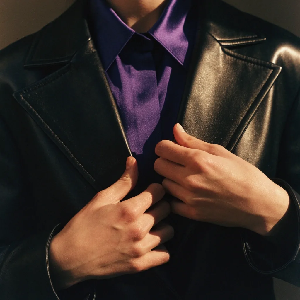
A leather glove resting beside folded deep purple fabric under evening light

The color story is a season. The architecture is the part that lasts.

Givenchy, read for its strictness

Givenchy: strict lines and evening weight

Givenchy appears in fall/winter 2026 discussions alongside leather gloves and royal purple, and its aesthetic leans stricter, more evening-oriented, and more architectural. The house remains relevant to conversations about tailoring and evening wardrobes, and it functions as a reference for polished luxury in a formal register.

That strictness is the point. Where other brands this season loosen proportions, Givenchy's direction holds structure, which makes it useful for anyone thinking about how a formal outfit gets its authority. The purple thread is the color story; the architecture is the substance.

Balenciaga, read for its reach

Balenciaga: avant-garde shapes and their reach

Balenciaga features in fall 2026 trend coverage as one of the brands shaping the conversation about new proportions. Its shows are associated with sharp silhouettes, experimentation, and a tension between practicality and concept. In 2026 the house remains a significant reference for discussing nonstandard clothing.

It's also the clearest example of how runway avant-garde reaches mass fashion. The exact garments rarely transfer; the ideas about volume, layering, and line do. Reading Balenciaga is useful even if you'd never wear the look, because it shows where next season's ordinary shapes are coming from.

In practice, you'll notice the influence later, in ordinary clothing: a dropped shoulder on a plain sweater, a longer line on a shirt, a wider trouser on a high street rail. That is what to look for when you check the trend notes in a season's time.

Where the idea lands

Runway avant-garde rarely transfers as a garment. It transfers as an idea about volume, layering or line — and it arrives a season later, quietly, in ordinary clothing.

If you want to see the reach, look at the shapes, not the looks.

How these notes are read

Every note on this page follows the same order: what the house stands for, the silhouette it's known for, and where that direction shows up in real dressing. It's a reading order, not a ranking — there's no best brand here, only different arguments about proportion, material and register.

If a note raises a question we haven't answered, the right place to look is the trend notes — they cover the season's wider moves — or the wardrobe guides, which take a silhouette and show it on an outfit rather than on a runway.

Corrections and follow-ups

If a brand note here reads wrong, or a silhouette we've described has moved since we wrote it, we want to hear about it. Notes like these get revised when the coverage shifts, and a correction from a reader is often the fastest route to fixing one.

For questions about materials, construction or aftercare, the materials and care section covers fabric behaviour and how to read it. For general enquiries, the contact page carries our New York address and working hours.